Interview with Horn Book's Roger Sutton

As always, it’s such a pleasure to talk with Roger Sutton at Horn Book about my latest book!

With Red, Laura Vaccaro Seeger completes a picture-book trilogy begun with Green in 2012 and continued with Blue in 2018. (We talk below about the possibilities of yellow, but Laura insists she is done.)

Roger Sutton: Terry [Borzumato-Greenberg; VP, marketing and publicity at Holiday House] sent me a copy of Red. I’ve been working from digital books for so long, it was a real pleasure to hold this in my hands.
Laura Vaccaro Seeger: I know what you mean. Especially books like this — they don’t translate well into digital form.

RS: I know, it’s tough. When I looked at the PDF, I’d forgotten that there would probably be cutouts.
LVS: Which are really important, and then it gets completely lost in the digital format.

RS: You’ve always been a very hands-on book creator.
LVS: The tangible part of books is something I really enjoy.

RS: And still using acrylic paint.
LVS: Yes.

RS: You wrote about your love for it in the Horn Book some years ago. “Push the Paint."
LVS: That’s right! You have a wonderful memory.

RS: No, I looked it up. How do you marry your delight in tactile qualities and your love for color? How do we see that expressed in your work?
LVS: That’s such a good question. I’ve always had a love of color, going as far back as I can remember; combining color, mixing color. Even when I was in animation, I’d work with lighting so it would affect color. The sheer joy of moving over into books was that I could add that tactile quality and be able to combine colors.

RS: Whenever I look at one of your books, I want to put my finger on the page and move it around. Like I’m...pushing the paint.
LVS: I take that as a compliment because we are in such a digital age. I love the ability to be able to make something up, something tactile — especially watching children. A teacher in Singapore showed me a video of his ten-year-old daughter reading one of my books. She was going back and forth with the pages, feeling them to find where the holes were. The holes are often integrated into the paintings so you don’t really see them until you turn the page or are beginning to turn the page. I love to see kids “reading” with their hands that way. It’s kind of an added dimension to the experience.

RS: There’s a sort of scary one on that spread where the fox discovers the nail. Ouch!
LVS: That’s true.

RS: This is my second interview recently for a book about a fox. What is in the water?
LVS: Isn’t it amazing how that happens? Not necessarily the same book, in any way.

RS: No, not at all. Completely different.
LVS: You would know better than I, but doesn’t that happen a lot? In a certain season or a certain year — it’s almost like the authors got together and decided to do it. But that’s never the case.

RS: Sometimes you can trace it back to an event, like some big scientific discovery will a couple of years later, result in a bunch of books for children about that particular topic. But why foxes? Why now?
LVS: I can answer that question for Red, if not for any others. While I was working on the story, one of the very first things I did was to identify anything red that I could think of. But I was particularly focused on animals, because I was looking for my protagonist; I was looking for my story. Right away, on my list of red animals, I circled “red fox” in my journal. But I immediately decided, no, I’m not going to use a fox, because it looks too much like a dog, and in Blue I used a dog. I completely ruled it out. I went on to write all these different versions of the narrative, using all different ideas — even at one point using red ants. It was pretty ridiculous. I was on the phone with Neal [Porter, VP and publisher, Neal Porter Books (an imprint of Holiday House)] one day, very, very frustrated — I wasn’t liking anything I was coming up with. It was a FaceTime call, so I showed him the page that I sent you. And he said, “Red fox.” I’m like, “No, no, a fox looks too much like a dog.” But he thought a fox was in the cat family! I said, “No, it’s in the dog family.” We got into this back-and-forth. And then I realized it doesn’t even matter which family it’s in. It doesn’t have to look at all like a golden retriever.

Sometimes when things stay in your head and you don’t work them out verbally with your editor, your friends, whomever, they might just get trapped there and wait. That conversation brought me back to realizing a red fox was perfect, especially because I pretty much knew what I wanted to happen. The protagonist would be up against all these obstacles — difficulty, pain, conflict, and rage — and everything I was trying to explore with the color. The fox was a good idea, but it took me a roundabout way to get there.

RS: When you settled upon a fox as your protagonist, did that change any of your thinking about the book up until that point?
LVS: What it did was solidify the narrative. It gave me something upon which to build, whereas, with everything else, I was trying to force it. With the fox, the story didn’t feel forced, and that’s something I try hard to avoid, having anything feel forced. The fox helped me move the narrative along. It would have been hard to even begin without really knowing what the story was.

RS: It’s interesting to me that you had an idea for a story before you even knew who it was going to be about. I guess I’m so used to thinking that characters come first.
LVS: Certain things were set in place because of the other two books. I knew it was going to be shades of the same color. I knew the trim size, and the fact that it was going to be a poem — a sixteen-line poem with four stanzas, two words in every line. All of that was set. This book was so inspired by the last one, Blue. I knew I wanted to explore feelings of conflict and exacerbation. I even have a wall in this book, and cages. You’re right, though — with my other books, usually the characters come to mind first. This was definitely the other way around.

RS: I think it’s to your credit that the three books, RedGreen, and Blue, are concept books, but I don’t really think of them that way, because they have such strong narratives.
LVS: Yeah, I don’t think of them as concept books either. Of the three, I suppose Green might be considered the most conceptual, perhaps, or the least narrative. I remember when the reviews started coming out for Green, and how much was made about doing the other colors. I remember thinking, No, no, it’s about the environment. The color’s just a tool. It’s about appreciating our environment. But then the other two really do have stories from the beginning through to the end. Because these books take so long to create — any picture book, but especially these because of the die-cuts — it’s really important, as the creator of the book, that I make something that I don’t get bored with halfway through. Having a story and characters that I’m invested in helps keep the interest going throughout that year or more that it takes to create the book.

RS: This is probably a really dumb question, but do you essentially paint the pages in order?
LVS: It depends on the book. With RedGreen, and Blue I had to because of the die-cuts. Every painting is a part of the one before it and the one after it. That means that I can’t skip around. I often have to go backwards. I’ll be painting the blood-red picture, for example, and I’ll realize, Oh, wait, that’s going to change what happens in rust red. I have to go back. Then I might do something that affects the page before that. I’m constantly taking one step forward and two steps back, going back into a painting that I thought I had finished. I’m used to this, so I never really think I’m finished until the book is printed. That wasn’t at all a dumb question! I’m trying to think if I ever go out of order. Probably with my earlier, more clearly conceptual books like The Hidden Alphabet — I definitely did that out of order. Each letter was self-contained. But for the most part I think I do go in order. Interesting — I wonder what other authors do.

RS: If you were to do a fourth book in this series — let’s say a book about happiness — what color would you use?
LVS: First of all, I’m intentionally labeling this a trilogy because I don’t want to do another one. But I didn’t want to do a second one after Green or a third one after Blue, so never say never. What would be a happy color? Yellow? Yellow’s kind of like fear, isn’t it? But it could be happy too. Sunshine and rainbows. Yellow would be the logical next one, I suppose. But I don’t really want to — you’re going to have to mark my words, and then call me up and go, "See?"

RS: But if you do yellow, then Green becomes the odd book out, because the other three are the primary colors.
LVS: That’s right. Except in additive colors, where green and blue are the primaries — light and television and animation. The primaries are red, green, and blue. In subtractive colors, it’s red, blue, and yellow.

RS: Wait a minute. What did you say about additive color? I’m confused.
LVS: Additive and subtractive color. Subtractive color is part of things that you see. Whatever the light is, it’s subtracting out all the colors you’re not seeing. If you see something purple, it’s the result of the light subtracting out all the other colors in the spectrum so that you’re seeing the purple. Pink is a subtractive color. Physical forms in our world are all being seen by subtractive colors. Additive color is light. If you add different color light together and mix them, they make another color. With additive color, the primaries are different. The primaries are red, green, and blue. You know how you’re always seeing RGB with a computer? That’s because the computer is showing you light, it’s not showing you pigment.

RS: Because we’re using computers now for so much of the process, how hard is it to make sure that what I see on paper is what you want me to see when you’re creating the initial painting?
LVS: That’s another good question. I think because of my experience with animation, and also because I scan the paintings myself — I have two answers. The reason I’ve scanned all but four or five or six of my books is because these die-cuts are so difficult to figure out, that if I were to expect anyone else to try it, the holes would all be in the wrong place. So I have to scan in the artwork and then figure out where the die-cuts are. I do that part of the project on the computer. The computer has two different modes: one is RGB, where it’s showing you 16.7 million colors; CMYK is the colors you can see with your eyes. The eye can’t see 16.7 million colors. When the printer takes the book, they print it in CMYK, because it’s not going to be light anymore. It’s physical paper. The problem is, if you stay in RGB, making your artwork on the computer, whether it be from scratch or the way I do it, with paint and then scan it in, you could get yourself in trouble. I actually did get myself in trouble with my very first book, I Had a Rooster. I didn’t know all this then. I was coming from animation, and I didn’t understand print at all. There’s a mode you can use to switch to CMYK after the artwork’s already done, just to make sure the colors don’t shift. CMYK doesn’t have as many choices as RGB. Oftentimes it happens with blues. Blues will read purpley if you’re not careful. Now it’s not hard for me, but I can definitely see where it could get somebody into trouble. If an artist is handing in regular art, without scanning it themselves, then the publisher is basically doing what I’m describing. They probably know what they’re doing, and that’s not a problem either. I think the problem would come if the artist is scanning it themselves and doesn’t realize that there could be that shift. I don’t think I’ve had that problem again since my very first book, because I’m very hyper-aware that it’s a potential danger.

RS: You also have an exceptionally close relationship with your publisher and your editor, Neal Porter. That must help.
LVS: Oh, yeah. I feel so lucky. The way we work is so much fun. We have meetings that don’t feel like meetings — they feel like hanging out. We work at the beach; we work wherever. I don’t know what it would be like to work with another editor.

RS: How many books has it been?
LVS: I think Red is the twentieth or twenty-first.

RS: Wow.
LVS: I’ve never been with another editor. I stumbled upon the perfect editor for me from the very beginning, not even knowing anything about the business. Kind of dumb luck. If I had done what you’re supposed to do, send in a submission with a stamped self-addressed envelope and all that stuff, I may never have met Neal. I didn’t realize you’re not supposed to call up a top editor and ask for a meeting.

RS: Well, we’re all lucky it happened. You’re lucky, Neal’s lucky, readers are lucky.
LVS: Thank you.

RS: You're welcome.

Publishers Weekly - Q & A with Laura Vaccaro Seeger

So thrilled to once again speak with the wonderful Sally Lodge from Publishers Weekly. Click here to see the interview and more!

So thrilled to once again speak with the wonderful Sally Lodge from Publishers Weekly. Click here to see the interview and more!

Publishers Weekly - Q & A with Laura Vaccaro Seeger
By Sally Lodge
Oct 07, 2021

Among Laura Vaccaro Seeger’s 20-plus picture books are a trio of titles revealing the ways that colors can evoke emotions. First came 2012’s Green, which was followed by Blue in 2018, and both were joined this week by Red. Seeger has won multiple awards for her work, including two Caldecott Honors (for First the Egg and Green) and two Theodor Geisel Seuss Honor Awards (forFirst the Egg and One Boy). From her home on Long Island, the author spoke with PW about her color-inspired trilogy; her rapport with her longtime editor, Porter; and what’s next on her creative agenda.

You’ve explored associations between color and emotion from three different angles. What inspired GreenBlue, and Red, and were they very different undertakings?

These three books were particularly challenging, each in its own way. Green was a challenge because I knew that I wanted to make a book about the environment, but that subject felt too big to come from my voice, so I had to figure out what to zoom in on. In fact, I left the book for a bit, thinking I wouldn’t do it at all, but then came back to it. And this book was especially challenging because every page has a die-cut hole that readers look through, so each painting is connected to the one before and the one after. What I painted on each page also affected the previous and subsequent pages, and that created a back-and-forth that sometimes felt like one step forward and two steps back.

In Blue you spotlight the loving bond between a boy and the family dog, from the child’s birth to the pet’s death. Did that storyline come more easily to you than the narrative in Green?

It was a different challenge, since Blue is a very personal book. At the beginning, it was going to be about two brothers modeled after my own two sons, who are three years apart. I envisioned the older boy, at the end, getting old enough that he was ready to move out of the house. But about three paintings in, I realized that because I wanted to make Blue about loyalty and friendship, loss and sadness, I needed to explore what real sadness is. When I was seven, I lost my two-year-old brother. He went to sleep one night and never woke up, and that set off a lifetime of difficulty dealing with loss. My family never talked about it—his name was never mentioned. I believe that we need to talk about loss, and about everything in fact, so Blue required a lot of deep digging.

And what was the genesis of Red, and the nuances of that color?

I had been thinking about how our country, and the world, had been divided by so much conflict in the last several years, and I decided to channel that into Red. This book involved a kind of inside-out process of working, first identifying the emotions that various shades of red could represent—including rage and love—and then finding the vehicle to explore them. Once I came up with the character of a fox who gets separated from his family and trapped by a human before finding his way home, the emotions he felt came to me automatically. The better I know a character, the more naturally I understand their feelings and they become very real to me.

Are there any other colors you wish you had explored—and might you add another hue to the series at some point?

think I’m sure that Red is the last book in this series—but then again, I said the same thing after Green and Blue! I have thought about how yellow evokes fear and anxiety, but that isn’t as automatically clear to me as the emotions evoked by green, blue, and red. If that happens again with another color, I might decide to explore that as well. I don’t want to be the kind of person who says I am definitely not doing this or that book. As I’ve said to Neal many times, it doesn’t matter what I want—a book will tell me if it needs to be written.

Neal Porter has been your editor since your very first book, I Had a Rooster, was published in 2001. What is at the root of your author-editor connection?

A very deep friendship. From the very beginning, I realized that Neal and I both gravitate toward the same kinds of books, and we both have a strong devotion to graphic design as well as fine art. As we made book after book together, I came to appreciate how organic our work style is. When we’re working, our conversations feel like those that you’d have spending time with a friend rather than during a work meeting. It’s very gratifying, especially when we are making progress! I feel so, so fortunate.

Has a new project that needs to be written beckoned to you recently?

I am now working on a book called I’m Not Lost, which came out of living through the pandemic, when so many of us were feeling lost rather than being physically lost. The story is about a girl traveling through a multitude of situations that are reflective of her changing moods and emotions, from uncertainty to anxiety to determination. She doesn’t know where she is going but she knows she is not lost. I think that’s a feeling kids will understand.

Red by Laura Vaccaro Seeger. Holiday House/Porter, $18.99 Oct. ISBN 978-0-8234-4712-1

The Making of RED

GREEN was the first in a trilogy. It’s a book about the many shades of green and about truly seeing and appreciating our environment.

I didn’t have any intention of creating a sequel to GREEN, but sometimes a book tells an author it needs to be written, and that’s exactly what happened with BLUE, a book about the myriad shades of blue and an exploration of the color in terms of loyalty, loss, sadness, and love.

After BLUE, I was certain there would be no more books in the series, but then the last few years happened where division in our society was increasing at an alarming rate. RED wanted to be written - a book about the many shades of red, of course, but also about red in terms of anger, conflict, rage, and ultimately empathy, and love.

As with all books, RED took many twists and turns before it began to take shape. Books always begin with an idea, but finding the story on which to build that idea can be painfully elusive at times! The following is a roadmap to the making of RED from start to finish.

The very first step is always a ton of thought over a seemingly endless period of time, which some may mistake for daydreaming, but regardless of what it’s called, it’s a super important step in the process of creating just about anything. Then came the journal entries. Here are a bunch of lists as I began to research the meaning of the color red, and to identify specific shades of the color and things that are red. (The shades that you see highlighted are the ones that I thought would make good illustrations or would work well in the developing story.)

The very first step is always a ton of thought over a seemingly endless period of time, which some may mistake for daydreaming, but regardless of what it’s called, it’s a super important step in the process of creating just about anything. Then came the journal entries. Here are a bunch of lists as I began to research the meaning of the color red, and to identify specific shades of the color and things that are red. (The shades that you see highlighted are the ones that I thought would make good illustrations or would work well in the developing story.)

The format was already established based on that of GREEN and BLUE, so I knew I needed to write a 16-line poem and the book would be 40 pages. Oh, and I knew that it would have die-cut holes on every page, but more about that later. So the next step was to write the poem, though I was fully aware that it would go through many, many revisions.

The format was already established based on that of GREEN and BLUE, so I knew I needed to write a 16-line poem and the book would be 40 pages. Oh, and I knew that it would have die-cut holes on every page - arghh, but more about that later. So the next step was to write the poem, though I was fully aware that it would go through many, many revisions.

The next step was to figure out what the narrative should be - the age-old question, WHERE IS THE STORY?! Though it was clear that within the story, there would be conflict, anger, etc., I still needed to figure out who the main characters were and what, specifically, they were experiencing. First it was a story about the rise and fall of a friendship. Then it was about an unwanted cat. There were many other iterations (most of them I can’t even remember at this point), but eventually, I decided that the main character would be a young red fox who’d been separated from his pack, and in the process of finding his way, he encountered all kinds of obstacles as his situation became increasingly dire.

Next step was to figure out what the narrative should be - the age-old question, WHERE IS THE STORY?! Though it was clear that within the story, there would be conflict, anger, etc., I still needed to figure out who the main characters were and what, specifically, they were experiencing. First it was a story about the rise and fall of a friendship. Then it was about an unwanted cat. There were many other iterations (most of them I can’t even remember at this point), but eventually, I decided that the main character would be a young red fox who’d been separated from his pack, and in the process of finding his way, he encountered all kinds of obstacles as his situation became increasingly dire.

Once I’d written the narrative about the lost fox, I decided that it was important for me to understand exactly where he’d been, where he was going, and how he’d get back to his pack. So, I drew a map which ended up helping so much with continuity and logistical detail, even though I never showed the map or used it in any of the illustrations. As it turned out, after losing sight of his siblings, the young fox stumbled upon an old guy’s property (someone we never actually see), and he spends the entire time trying to make his way off that property and back to his fox family. It’s crucial for an author to really know and understand their characters in order to bring authenticity to the story, even if some of those details are never explicitly revealed to the reader.

Once I’d written the narrative about the lost fox, I decided that it was important for me to understand exactly where he’d been, where he was going, and how he’d get back to his pack. So, I drew a map which ended up helping so much with continuity and logistical detail, even though I never showed the map or used it in any of the illustrations. As it turned out, after losing sight of his siblings, the young fox stumbled upon an old guy’s property (someone we never actually see), and he spends the entire time trying to make his way off that property and back to his fox family. It’s crucial for an author to really know and understand their characters in order to bring authenticity to the story, even if some of those details are never explicitly revealed to the reader.

Untitled-2.png
Next came settling on an art style. I approach every book with a completely open mind when it comes to the art style, and I allow the story to guide me in deciding upon things like mood, brushstrokes, and media (acrylic paint, oil paint, collage, watercolors, charcoal, etc.) With RED, the style was roughly in place from the start because the book is part of a trilogy, but I still had some leeway because of the storyline. Above are some examples of the first sketches and paintings.

Next came settling on an art style. I approach every book with a completely open mind when it comes to the art style, and I allow the story to guide me in deciding upon things like mood, brushstrokes, and media (acrylic paint, oil paint, collage, watercolors, charcoal, etc.) With RED, the style was roughly in place from the start because the book is part of a trilogy, but I still had some leeway because of the storyline. Above are some examples of the first sketches and paintings.

Finally, the fox has come to life!

And finally, the fox came to life!

There were many editorial decisions made during the creation of RED. For example, with “blood red”, I’d decided that this image was depicting a pivotal moment in the story where the young fox’s situation was getting terribly dire. Because of this, I felt it was important that more than anything, his emotions be emphasized as much as possible, so even though I considered many different ways of illustrating “blood red”, in the end I really felt it necessary to zero in on the fox and his feelings…

There were many editorial decisions made during the creation of RED. For example, with “blood red”, I’d decided that this image was depicting a pivotal moment in the story where the young fox’s situation was getting terribly dire. Because of this, I felt it was important that, more than anything, his emotions be emphasized as much as possible.

Untitled-2.png
Above are the final art spreads for “blood red” and “rage red”. Emotion and empathy are at the core of RED, and while “blood red” is definitely an emotional turning point in the story, “rage red” is the culmination of all that came before.

Above are the final art spreads for “blood red” and “rage red”. Emotion and empathy are at the core of RED, and while “blood red” is definitely an emotional turning point in the story, “rage red” is the culmination of all that came before.

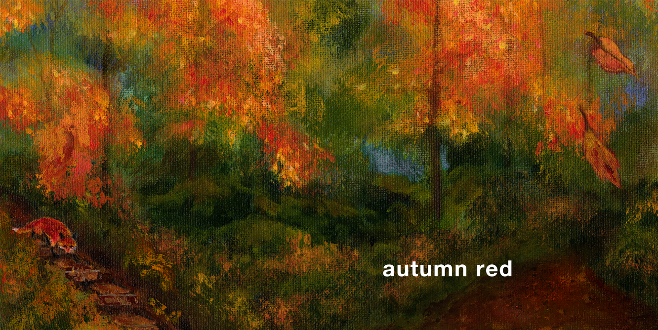
There were also times when even though I’d planned on having certain lines in the poem and occurrences in the story, it became clear that it just wasn’t working for one reason or another. Above are a couple of examples of that. I’d originally had a stanza in the poem that read, “rose red, flame red, rust red, lame red”. “Flame red” had become problematic because I really didn’t want to show anyone in the book except for the fox, his family, and the young empathetic girl who comes to his rescue - I wanted to keep all the attention on the emotion of his plight. I tried several different ways of handling this spread, but in the end decided to replace it with “mud red”.Then there was “lame red”. It was my son, Drew, who first brought to my attention that the word “lame” might be offensive to certain readers. This prompted extensive discussions with Neal (my editor, Neal Porter), children, young adults, and many of my librarian and teacher friends. At first, the writer in me resisted. After all, the definition of the word lame, “a person or animal unable to walk because of an injury to the leg or foot”, made it the perfect word, I thought, and Neal agreed. But the more we talked about it, the more we realized that it’d be better to err on the side of caution with this one, and ultimately, I replaced “lame red” with “autumn red” and rearranged the poem accordingly.

There were also times when even though I’d planned on having certain lines in the poem and occurrences in the story, it became clear that it just wasn’t working for one reason or another. Above are a couple of examples of that. I’d originally had a stanza in the poem that read, “rose red, flame red, rust red, lame red”. “Flame red” had become problematic because I really didn’t want to show anyone in the book except for the fox, his family, and the young empathetic girl who comes to his rescue - I wanted to keep all the attention on the emotion of his plight. I tried several different ways of handling this spread, but in the end decided to replace it with “mud red”.

Then there was “lame red”. It was my son, Drew, who first brought to my attention that the word “lame” might be offensive to certain readers. This prompted extensive discussions with Neal (my editor, Neal Porter), children, young adults, and many of my librarian and teacher friends. At first, the writer in me resisted. After all, the definition of the word lame, “a person or animal unable to walk because of an injury to the leg or foot”, made it the perfect word, I thought, and Neal agreed. But the more we talked about it, the more we realized that it’d be better to err on the side of caution with this one, and ultimately, I replaced “lame red” with “autumn red” and rearranged the poem accordingly.

One of my favorite things about the process of writing and creating picture books is the fact that we often spend so much time contemplating a single word! I remember a similar circumstance when I was writing BULLY, a book about a little bull who tries to feel bigger by calling mean names to his barnyard friends. He says, “slow poke,” to the turtle, and “you stink,” to the skunk. Originally, I’d planned on having him say, “shut up” to the rooster. We spent many hours discussing whether or not “shut up” crossed the “meanness” line and went too far. Ultimately and interestingly after consulting with a wide range of friends, people who didn’t have children felt that “shut up” was just fine, but it was the parents who confirmed my instinct that we should leave it out because we teach our kids not to say “shut up”, so I removed it from the narrative.

One of my favorite things about the process of writing and creating picture books is the fact that we often spend so much time contemplating a single word! I remember a similar circumstance when I was writing BULLY, a book about a little bull who tries to feel bigger by calling mean names to his barnyard friends. He says, “slow poke,” to the turtle, and “you stink,” to the skunk. Originally, I’d planned on having him say, “shut up” to the rooster. We spent many hours discussing whether or not “shut up” crossed the “meanness” line and went too far. Ultimately and interestingly after consulting with a wide range of friends, people who didn’t have children felt that “shut up” was just fine, but it was the parents who confirmed my instinct that we should leave it out because we teach our kids not to say “shut up”, so I removed it from the narrative.

Untitled-12.png_0002_Layer-37.png

Once the poem and the art style were in place, I was on my way to creating all the spreads. But not so fast, because as promised, there are those pesky die-cuts to discuss!

The die-cuts are a major challenge because they connect every painting to each other. Every painting is literally a part of the one before and the one after. It’s a puzzle that at times is extremely frustrating, but ultimately very rewarding.

As with all books, I make rules for myself. One of the rules about the die-cuts is that they not be forced and that they seamlessly integrate with every painting. Once when visiting Singapore, Scott Riley, one of the teachers at the American School, showed me a video of his daughter reading GREEN, and the incredible thing about it was that she was not only reading with her eyes, but she was also reading with her hands. Before turning each spread, she was feeling the pages to locate the die-cuts.

Another die-cuts rule is that it’s essential they have a reason for being included. So with GREEN, BLUE, and RED, that reason is connectivity, not just between the three books, but within each individual book, as well. In GREEN, as in our environment, everything is connected. In BLUE, as in the circle of life, everything is connected. And in RED, as in overcoming obstacles, finding one’s way, empathy, and love - everything is connected.

But in reality, creating that connectivity often required going back into a completed painting in order to make the die-cuts work. So, there was a lot of back and forth and the paintings weren’t really complete until the whole book was done. Here are some examples of that process:

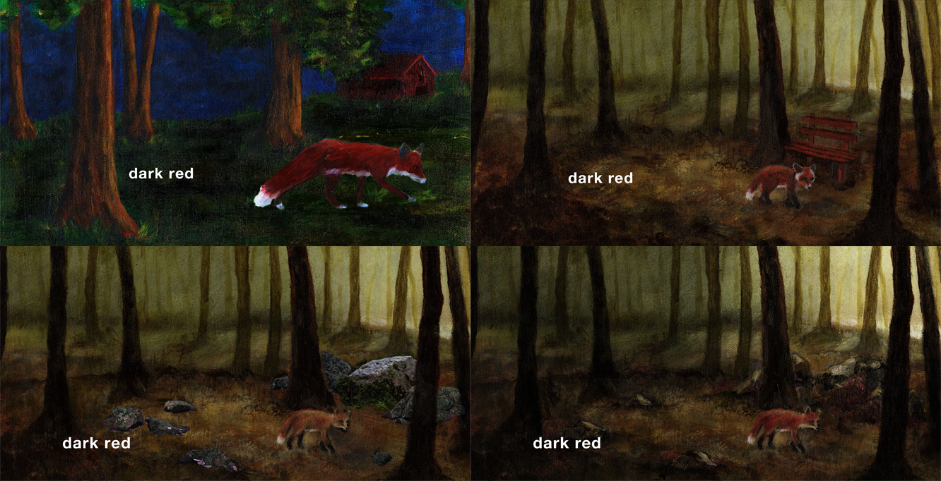
In the early stages of “light red”, I needed a die-cut that would show through to the previous “dark red” spread. I tried a wooden sign, but that seemed contrived and didn’t really fit in with the natural setting. The implication was that there was a trail or a park nearby, and I thought it took the attention away from the fox…

In the early stages of “light red”, I needed a die-cut that would show through to the previous “dark red” spread. I tried a wooden sign, but that seemed contrived and didn’t really fit in with the natural setting. The implication was that there was a trail or a park nearby, and I thought it took the attention away from the fox…

Ultimately, on the left side of this spread, I decided to put a tree in the foreground, and the knot in the tree is the inconspicuous die-cut. Of course, as I mentioned earlier, there was a ton of back and forth between this spread and the previous one to make sure that the die-cut worked on both spreads. Next, I had to figure out what the die-cut would be on the right side of the “light red” painting. Another die-cut rule (for all three books in this trilogy), is that on the right side of the spread, the color shown through the die-cut must match the text. So I needed something that was light red for the die-cut here. I tried birds first, and then butterflies, but they all felt way too forced…

Ultimately, on the left side of this spread, I decided to put a tree in the foreground, and the knot in the tree is the inconspicuous die-cut. Of course, as I mentioned earlier, there was a ton of back and forth between this spread and the previous one to make sure that the die-cut worked on both spreads. Next, I had to figure out what the die-cut would be on the right side of the “light red” painting. Another die-cut rule (for all three books in this trilogy), is that on the right side of the spread, the color shown through the die-cut must match the text. So I needed something that was light red for the die-cut here. I tried birds first, and then butterflies, but they all felt way too forced…

Finally, the mushrooms did the trick, providing the connectivity I needed, while simultaneously feeling like a natural part of the painting.

Finally, the mushrooms did the trick, providing the connectivity I needed, while simultaneously feeling like a natural part of the painting.

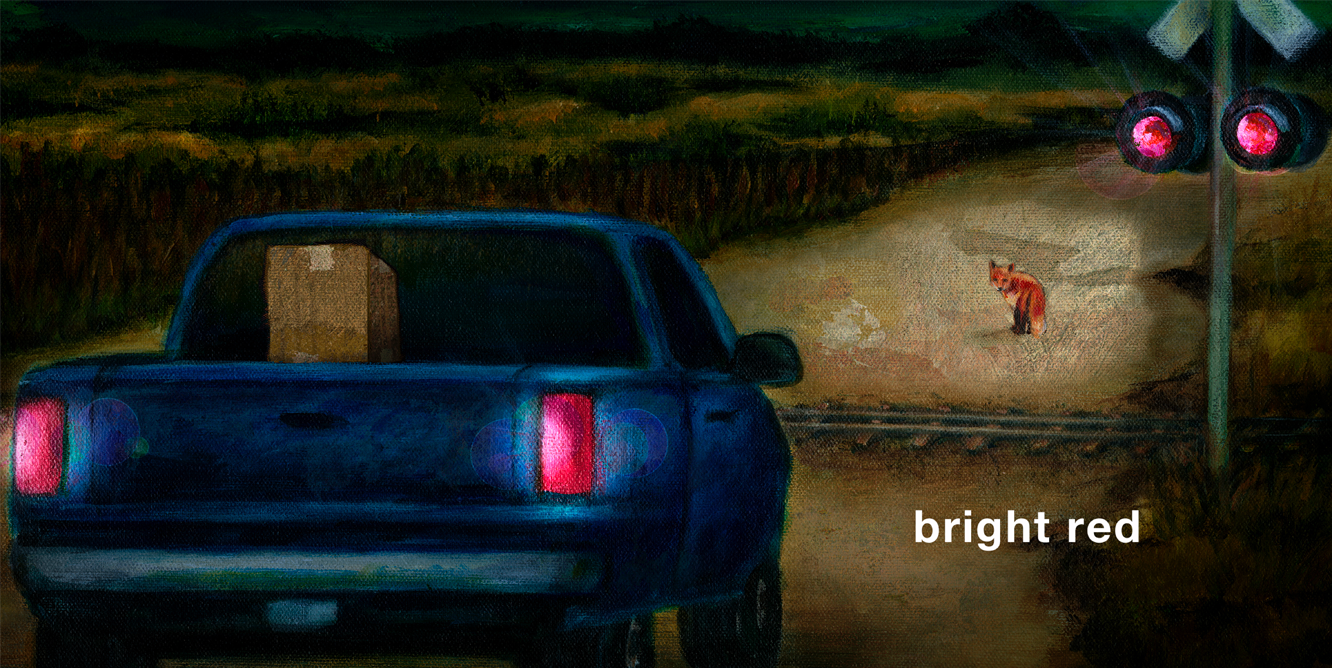
Speaking of connectivity, here’s an example of an author knowing something about the book (or books) that may not be at all obvious to the reader, but somehow it adds a layer of authenticity to the work, even if it’s subconsciously realized.In my mind, the young girl who ultimately rescues the fox in RED is the same girl who is standing with her father at the end of GREEN. And her father is the boy we see grow up in BLUE who in the final spread falls in love, and sometime in the future they become the girl’s parents. (I’m not sure that even I can follow what I just described, but there you have it!)One of the things that was super important to me was that I stay true to the behavior of a young fox. I was particularly concerned in the painting above where the girl opens the door to coax the fox out of the cage, that the fox would actually cower in the corner of the cage rather than dart out the moment the door opened. I consulted with fox experts at the Museum of Natural History and was reassured that a young fox would be quite timid and frightened in such a situation and would not run away so quickly.

Speaking of connectivity, here’s an example of an author knowing something about the book (or books) that may not be at all obvious to the reader, but somehow it adds a layer of authenticity to the work, even if it’s subconsciously realized.

In my mind, the young girl who ultimately rescues the fox in RED is the same girl who is standing with her father at the end of GREEN. And her father is the boy we see grow up in BLUE who in the final spread falls in love, and sometime in the future they become the girl’s parents. (I’m not sure that even I can follow what I just described, but there you have it!)

One of the things that was super important to me was that I stay true to the behavior of a young fox. I was particularly concerned in the painting above where the girl opens the door to coax the fox out of the cage, that the fox would actually cower in the corner of the cage rather than dart out the moment the door opened. I consulted with fox experts at the Museum of Natural History and was reassured that a young fox would be quite timid and frightened in such a situation and would not run away so quickly.

One last thing about the making of this and really any book - especially picture books - is that every single image and every single word needs to be carefully chosen, and as a creator it’s important to be able to admit when a word or a piece of art isn’t working for whatever reason. Given that love and empathy are truly at the heart of RED, it was really important that the final painting convey those emotions. Word choice is even more imperative in poetry because there are so few, and every word carries the weight of so much meaning. And when the perfect word is discovered, it’s a wonderful feeling, as with “just red” in the final spread. A single word can convey multiple meanings, in this case “just” as in “only”, but also “just” as in “justice”. And the fact that the door can be left wide open for the reader to find their own meaning is for sure an author’s privilege.

One last thing about the making of this and really any book - especially picture books - is that every single image and every single word needs to be carefully chosen, and as a creator it’s important to be able to admit when a word or a piece of art isn’t working for whatever reason.

Given that love and empathy are truly at the heart of RED, it was really important that the final painting convey those emotions. Word choice is even more imperative in poetry because there are so few, and every word carries the weight of so much meaning. And when the perfect word is discovered, it’s a wonderful feeling, as with “just red” in the final spread. A single word can convey multiple meanings, in this case “just” as in “only”, but also “just” as in “justice”. And the fact that the door can be left wide open for the reader to find their own meaning is for sure an author’s privilege.

Click here for a video where I discuss more about the making of RED!

Projects, projects, projects while we're all at home

I hope all of you are safe and well during this difficult time. The Coronavirus has affected the lives of every single person around the globe, and I know our wonderful teachers, librarians, and parents are doing everything possible to make sure that the children are calm, busy, and protected.

Here are a whole bunch of activities, projects, and movies based on many of my books. Please feel free to download and print whatever you like. I hope you’ll find them useful, but most of all fun!

Read more

Why? Explained...

Laura Vaccaro Seeger Explains WHY?

June 28, 2019
By Tara Lazar

At the risk of dating myself, I’ll mention an old commercial tag line from the 1970’s—“when E.F. Hutton talks, people listen.”

Well, when Holiday House contacts you and asks if you’d like to chat with two-time Caldecott and Geisel Honor book winner Laura Vaccaro Seeger, you also stop everything and LISTEN!

Laura’s latest book is a charmer, snuggle-worthy for the littlest ones. It’s titled, simply, WHY?

Read more

The Making of WHY

In August 2019, my newest book, WHY?, will be released. Here’s a sneak peak of how it came to be!

I became intrigued with the idea of a book involving a character who incessantly questioned everything.

From the very beginning, I’d pictured a rabbit and a bear, but for the longest time, I resisted having a bear as a main character because I didn’t want him to be confused with Bear from my DOG AND BEAR series. Ultimately, I knew he’d be painted to look very different from Dog’s friend, Bear, so I let go of that nagging worry.

So, in the first few journal entries, I tried to figure out (as always) what the story would be. I played my usual “what if” game, and explored as many directions as possible.

Read more

Starred review for BLUE - Judy Freeman's “What’s New in Children’s Literature and Strategies for Using It in Your Program"

⭑Review of Laura Vaccaro Seeger’s Blue
from Judy Freeman’s handbook for her seminar for teachers and librarians: “What’s New in Children’s Literature
and Strategies for Using It in Your Program (Grades K-6)”

Blue. Seeger, Laura Vaccaro. Illus. by the author. Roaring Brook, 2018. {ISBN-13: 978-1-62672-066-4; 36p.}

Wow. That’s what you’ll say when you finish reading and taking in the sweeping full-bleed acrylic paintings in Laura Vaccaro Seeger’s dazzling companion book to her Caldecott Honor-winner, Green. Just, wow!

Read more

Horn Book - Five Questions for Laura Vaccaro Seeger

In her 2013 Caldecott Honor Book Green, Laura Vaccaro Seeger considered the many literal and metaphorical shades of the title color. What does she do with Blue?

1. First in Green and now in Blue: what inspired the die-cuts?
My rule for die-cuts is that they must be integral to the book. In Green, they are necessary because it’s a book about how everything in our environment is connected. The paintings are literally connected to one another. Since Blue is Green’s companion book, it needed to share its format. But that’s not reason enough — in Blue, the die-cuts are absolutely integral because all of our experiences from birth onward are connected and define how we live our lives.

Read more

BYU Radio - Dog and Bear Interview

I recently had a chance to speak with BYU Radio about DOG AND BEAR, and Neal Porter, too, so that always makes me happy. We spoke about the inspiration, process, and challenges of writing and illustrating books for children.

Special thanks to Christine Nokleby, Jessica Verzello, and Rachel Wadham for a totally fun interview.

Click here to have a listen! (The interview begins at about 2:48.)

Ignorance is Bliss!

I am excited and honored to have illustrated a new picture book, written by the amazing Dick Jackson, (due for release later this year). It's the very first time I've illustrated another writer's manuscript, though in this case, it was an easy decision for me.

Back in 1999, when I decided to make a huge move to publishing from a career as an animator/producer in network television, I knew nothing about the business and I had no contacts. But ever since I was a child, I'd been logging ideas for picture books in my journals, and I'd created quite a few one-of-a-kind books that I'd never shown anyone.

So one day, I took the plunge, and called Dick Jackson…

Read more

I Used to Be Afraid - But not anymore!

Last week, I received a letter from a librarian whose class of first graders spent the entire session discussing the little girl's book in "I Used to Be Afraid". They'd determined that because her book appears in several spreads, it must be her favorite. And through closer (and very impressive) observation, they'd decided that it, too - the meta-book - must be a book about fears. Perhaps it's one that helped her to change the way she looks at things and not be so fearful after all!

Read more

I Used To Be Afraid

I USED TO BE AFRAID will be released in a few weeks. Here is a little bit of backstory on how the book came to be...

I USED TO BE AFRAID is a book about perspective. It's all in the way you look at things. In the case of our protagonist - this one little girl - she used to be afraid. Very afraid. Until she learned to change the way she viewed her world.

These are the book's first journal sketches from way back in 2007...

Read more